Frood: Redefining Healthy Convenience in Home Cooking
There’s a common pitfall for many “healthy” food brands—a worthy, yet somewhat joyless aesthetic that emphasizes goodness but risks omitting the pleasure of eating. Frood, a new range of whole-food cooking blends, successfully navigates this challenge with the help of London studio Regular Practice.
The Vision Behind Frood
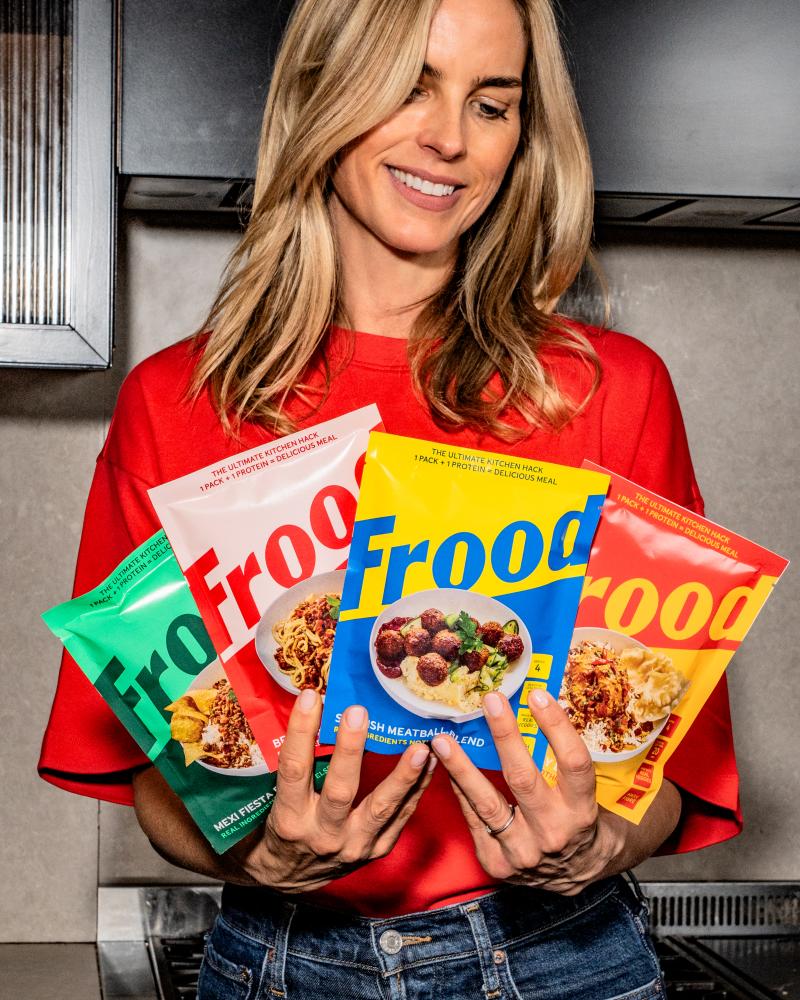
Founded by Frida Redknapp—a Swedish mother of five and a trusted voice in family cuisine—Frood aims to make healthy cooking easy without compromising on flavor. The product line includes four cooking blends: Swedish Meatballs, Bella Bolognese, Golden Curry, and Mexi Fiesta. Each blend contains a mix of dried fruits, vegetables, grains, seeds, plant proteins, and other wholesome ingredients. To prepare a complete meal in just 20 minutes, you simply add your choice of protein and a little water and oil. Notably, these blends are fiber-rich, a natural source of protein, and free from ultra-processed ingredients.
The Design Challenge
How does a brand convey convenience, nutrition, speed, and care simultaneously? Regular Practice faced the difficult task of making all these aspects feel like one joyful idea on supermarket shelves. They had to balance the health narrative with a warmth that wouldn’t make the product feel like a supplement while ensuring it didn’t lean so much into convenience that it lost authenticity.
Bold Branding Choices
The branding for Frood is striking. The wordmark is a sturdy, oversized sans-serif that can be seen from afar, making it memorable—an essential trait for any challenger brand. By using vibrant colors for each blend, Frood creates a cohesive family identity while allowing each flavor to stand out: vibrant blue and yellow for Swedish Meatballs, warm reds for Bolognese, and earthy greens for Mexi Fiesta.
The consistent design allows the wordmark to flip colors against different backgrounds, ensuring that the logo remains prominent even as the palette changes.
Compelling Imagery
Accompanying photography by James Moyle not only showcases the finished products but does so in an aspirational manner that appeals to the target market. With simple, reassuring phrases like “the ultimate kitchen hack” and “real ingredients, nothing else,” Frood manages to convey nutritional value without sounding preachy.
Conclusion
Frood aligns with Redknapp’s belief that food should bring joy, connection, and well-being to everyday life. The brand is tailored for busy individuals seeking real nourishment without hassle. In a market bustling with options, the clear and clever branding plays a crucial role in helping potential customers quickly understand what sets Frood apart. Regular Practice has indeed succeeded in crafting a delightful and coherent identity for this exciting new range.