Welcome back! Apologies for the wait—between handling agents and video exports, it’s been a busy time.
I’m excited to share one of my major projects.
I have compiled 107 million rows of spending data from UK councils and created an interactive platform to explore how each council allocated its funds.
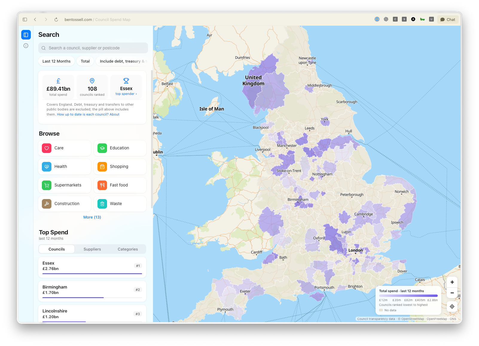
The data I used is publicly available, though not particularly easy to access or format.
Although many of you may not be based in the UK, I embarked on an interesting journey to gather and analyze this data.
You can find the session summary, which includes all linked files and prototypes, here. You can also view the complete agent sessions from this project.
I’m currently finalizing adjustments to the website and the data before making it open-source.
This week’s update is slightly different—my video explains it.
Statistics:
Codex deployed three subagents in sequence to gather this information, consolidating data from various council websites, many of which displayed information in unusual formats. This yielded a catalogue of 31 official sources, and real data from five councils was collected, with checksums ensuring data integrity. I then began querying the data: “which councils spent the most?”, “what areas did they spend on?”, and “who received payments?”.
Once I obtained an initial dataset, it was standardized into a comprehensive spreadsheet, requesting additional data for my own council in Bedfordshire as well.
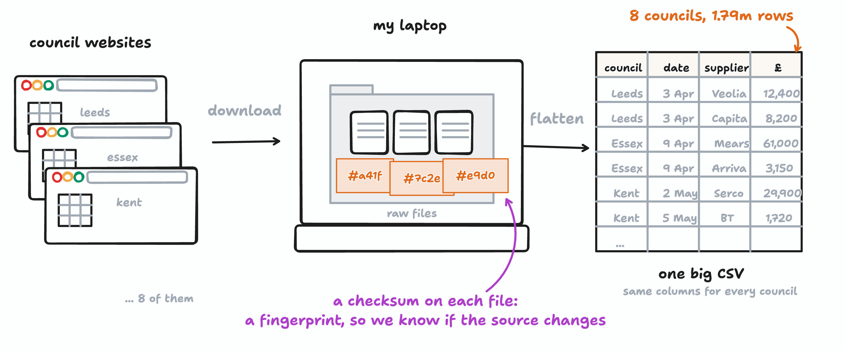
As I gathered data, I realized there were logistical challenges I hadn’t anticipated, such as identifying different councils in Bedfordshire—namely Bedford, Central Bedfordshire, and Luton. This prompted a subagent to fetch additional data. Initially, two councils were blocking our access, but our agents eventually navigated around those barriers. Ultimately, I ended up with data from eight councils, totaling 1.8 million rows and £9 billion in expenditures neatly organized into a single CSV file on my laptop. I also created a mini blueprint of my data collection approach.
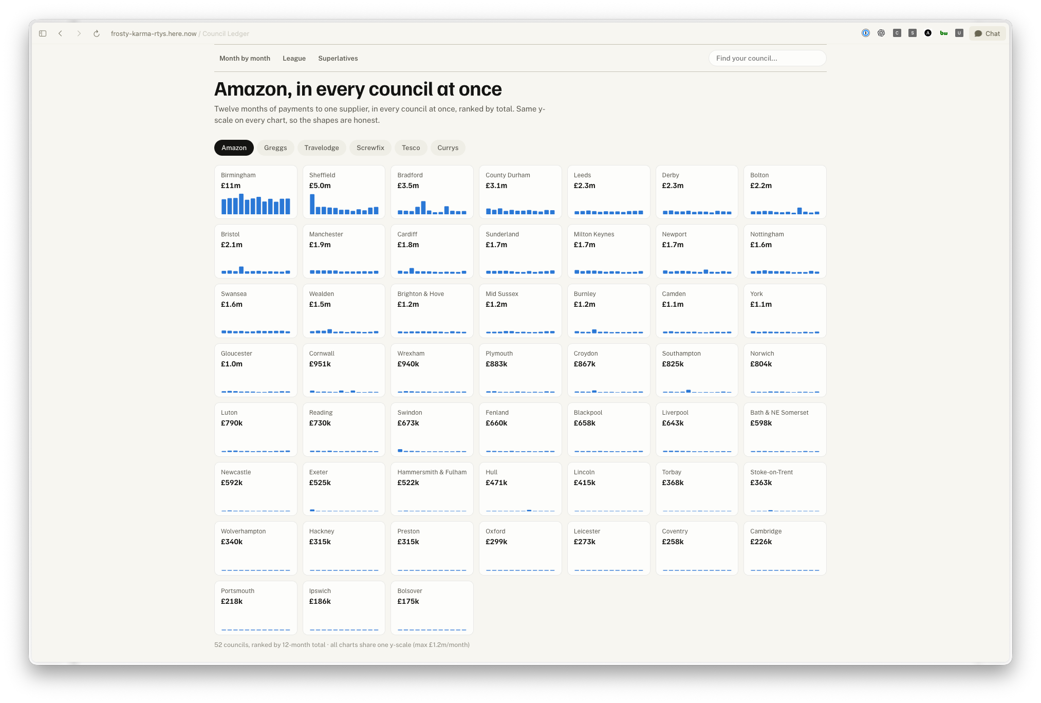
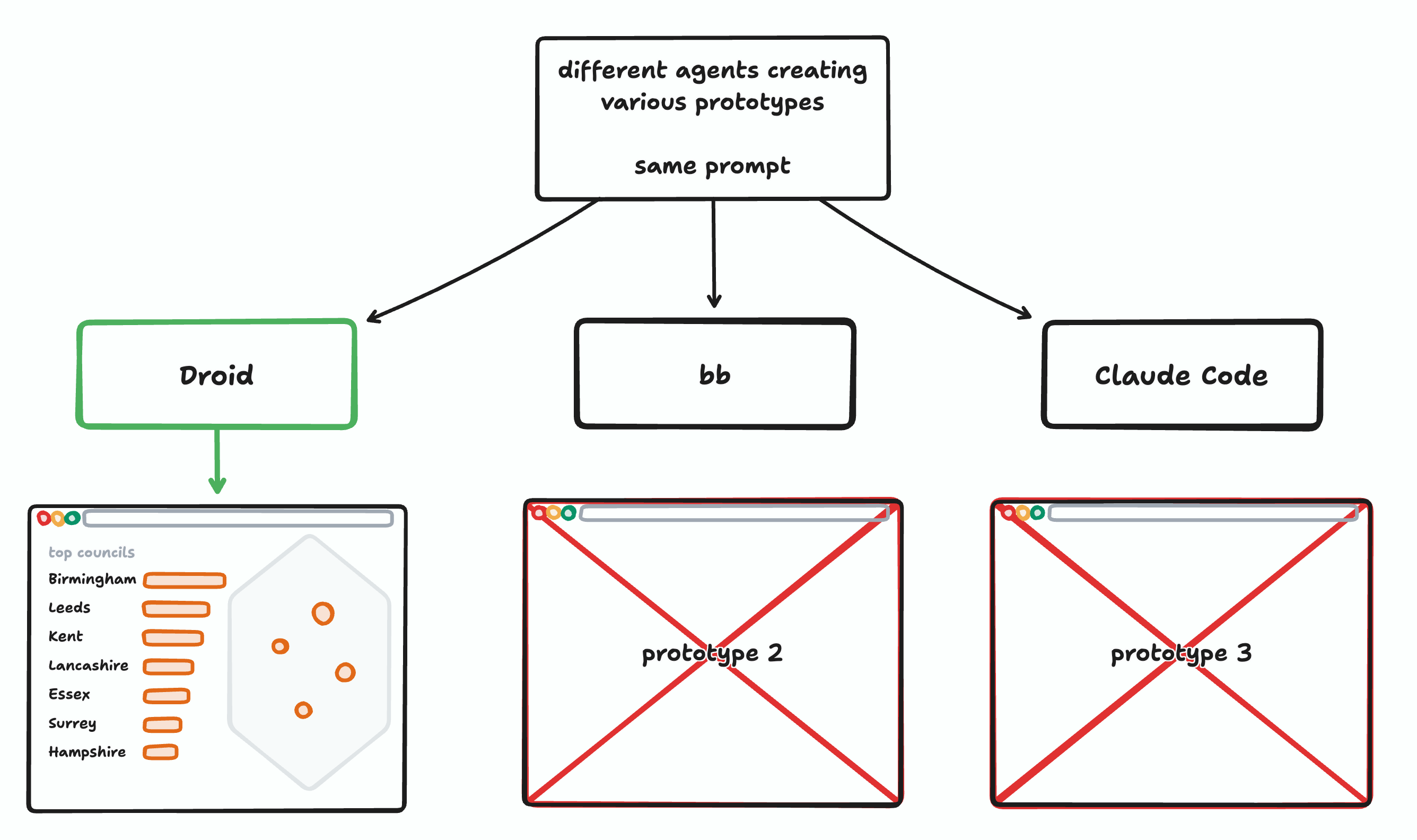
I asked several agents to build prototypes to visualize the data in diverse formats, such as receipts, bank statements, grids of counties, and even a mini-site titled ‘Your County’s Favourite Retailer’. This published everything directly to [here.now](https://here.now), allowing me to interact with real examples instead of relying solely on screenshots. I also generated a few engaging data visualization stories similar to those produced by Pudding.
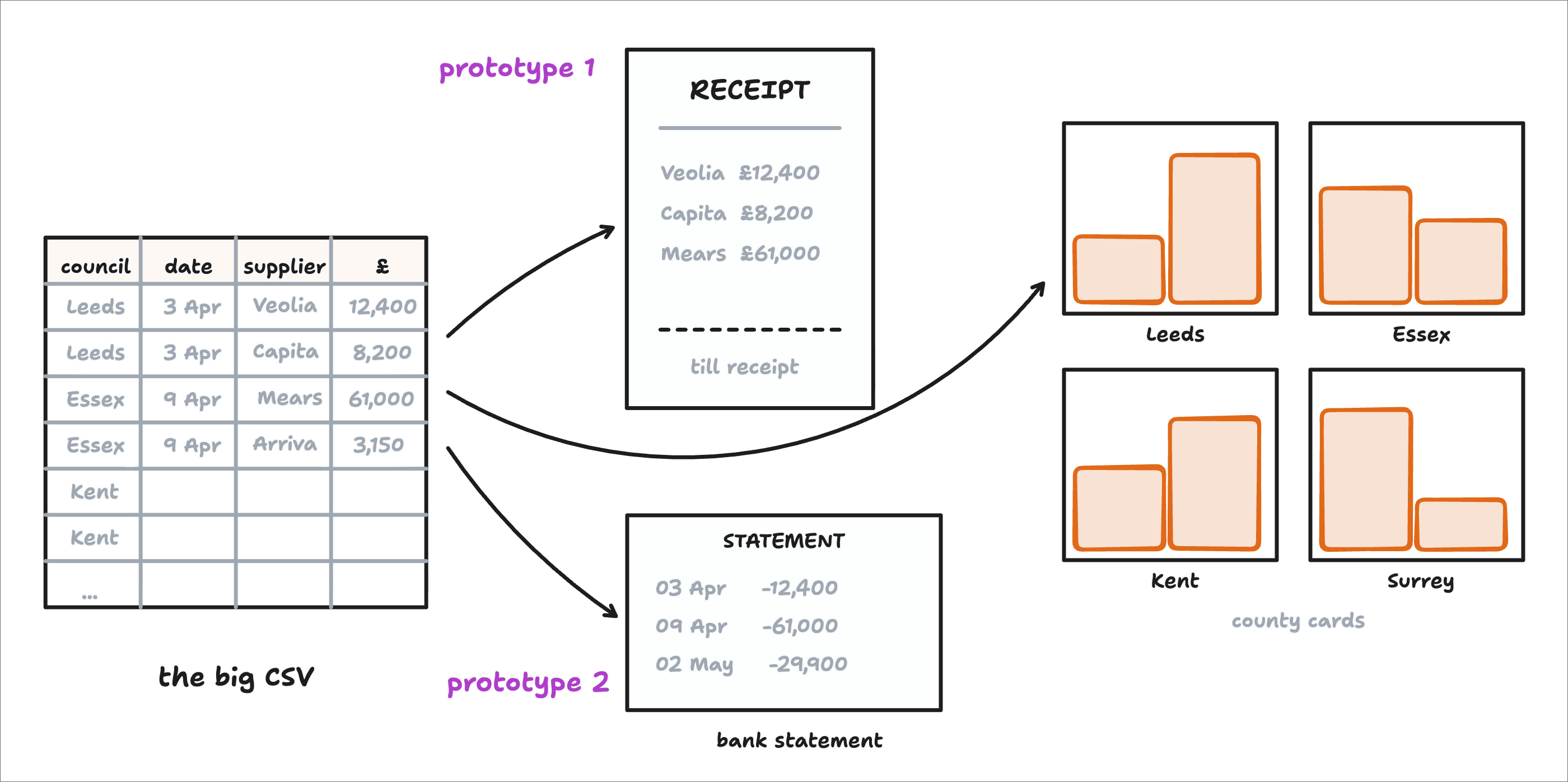
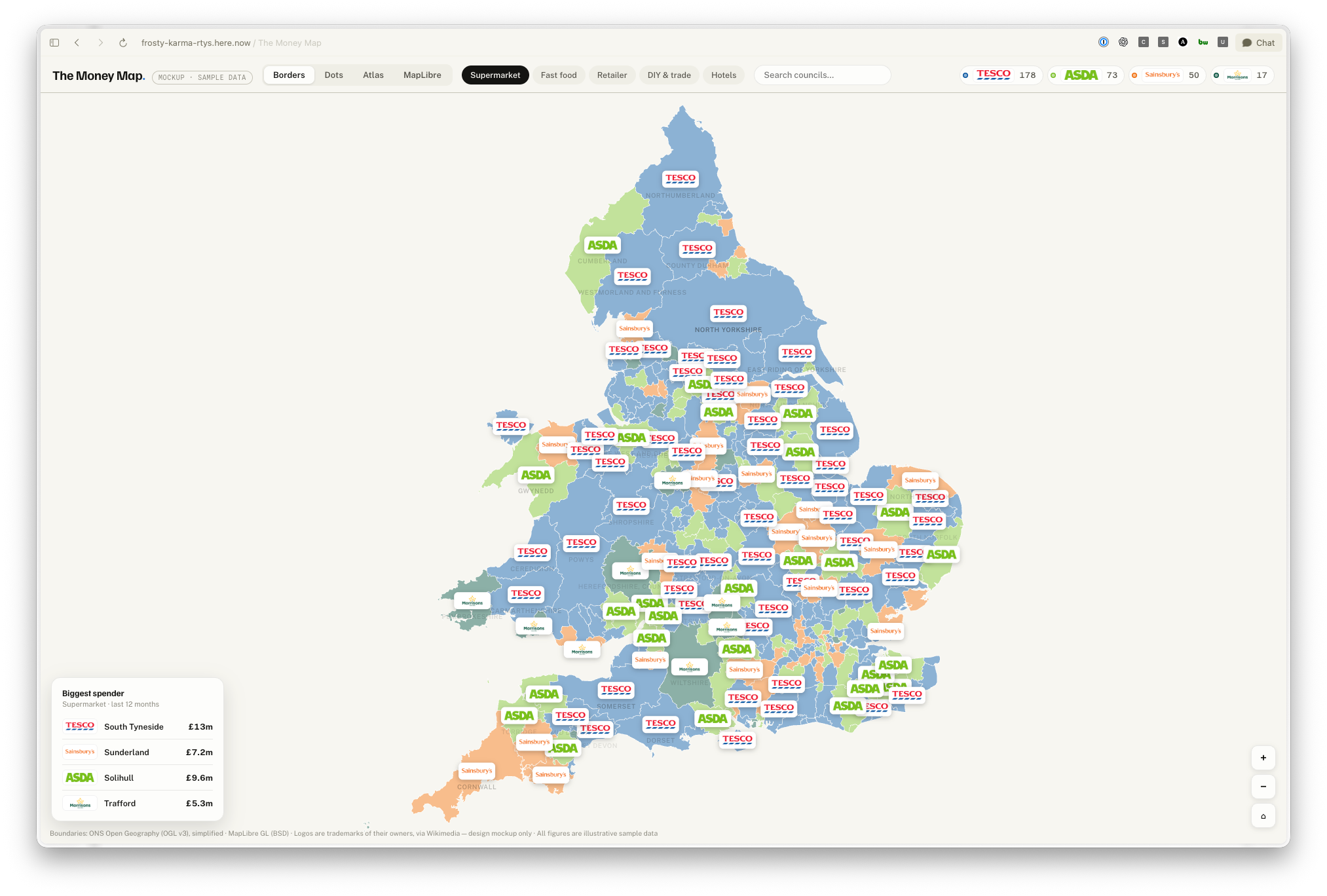
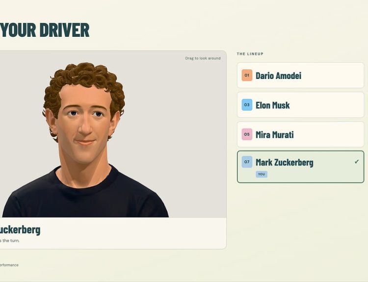
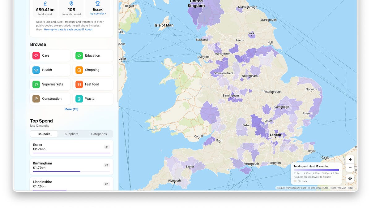
Some of the prototypes developed:
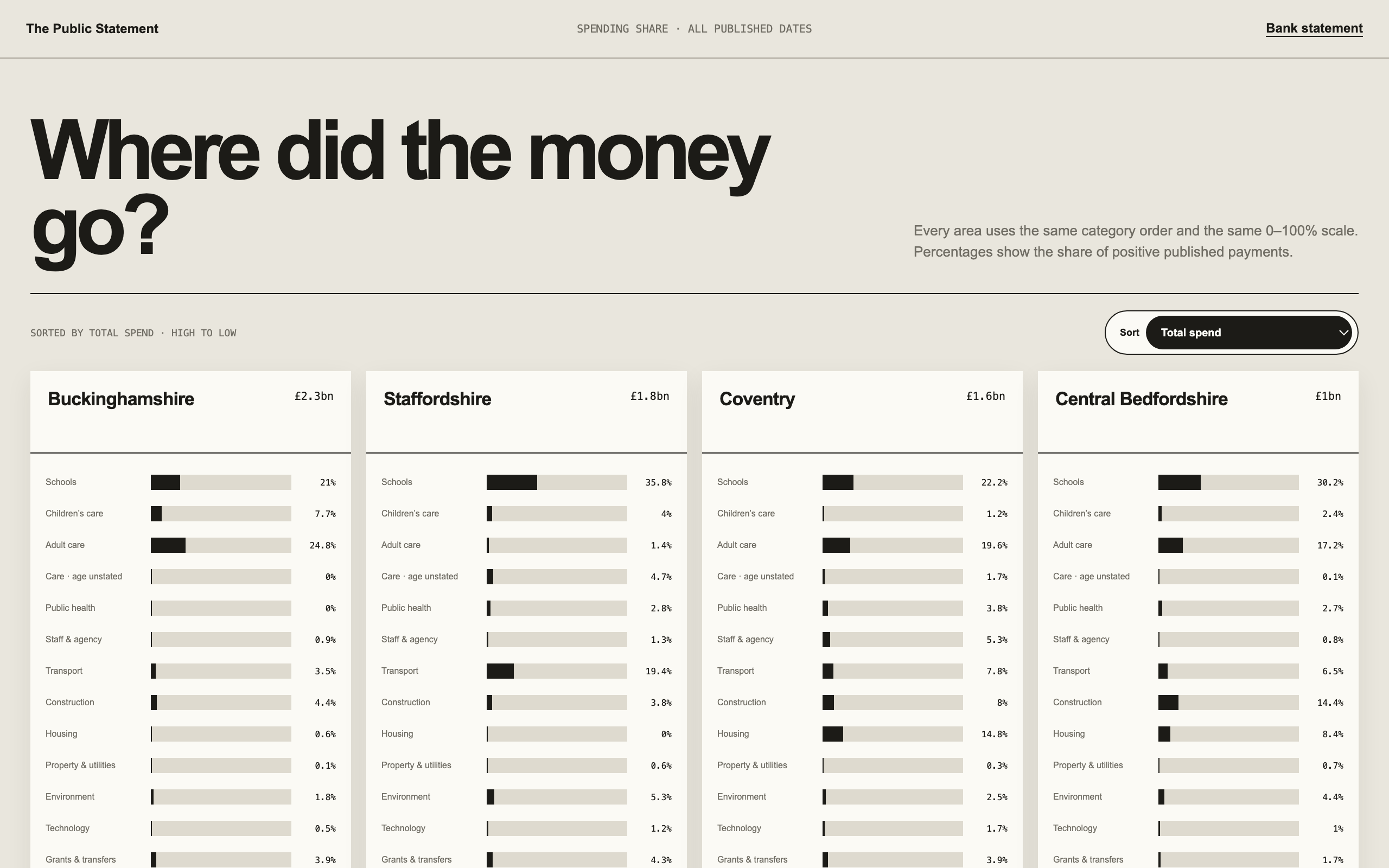
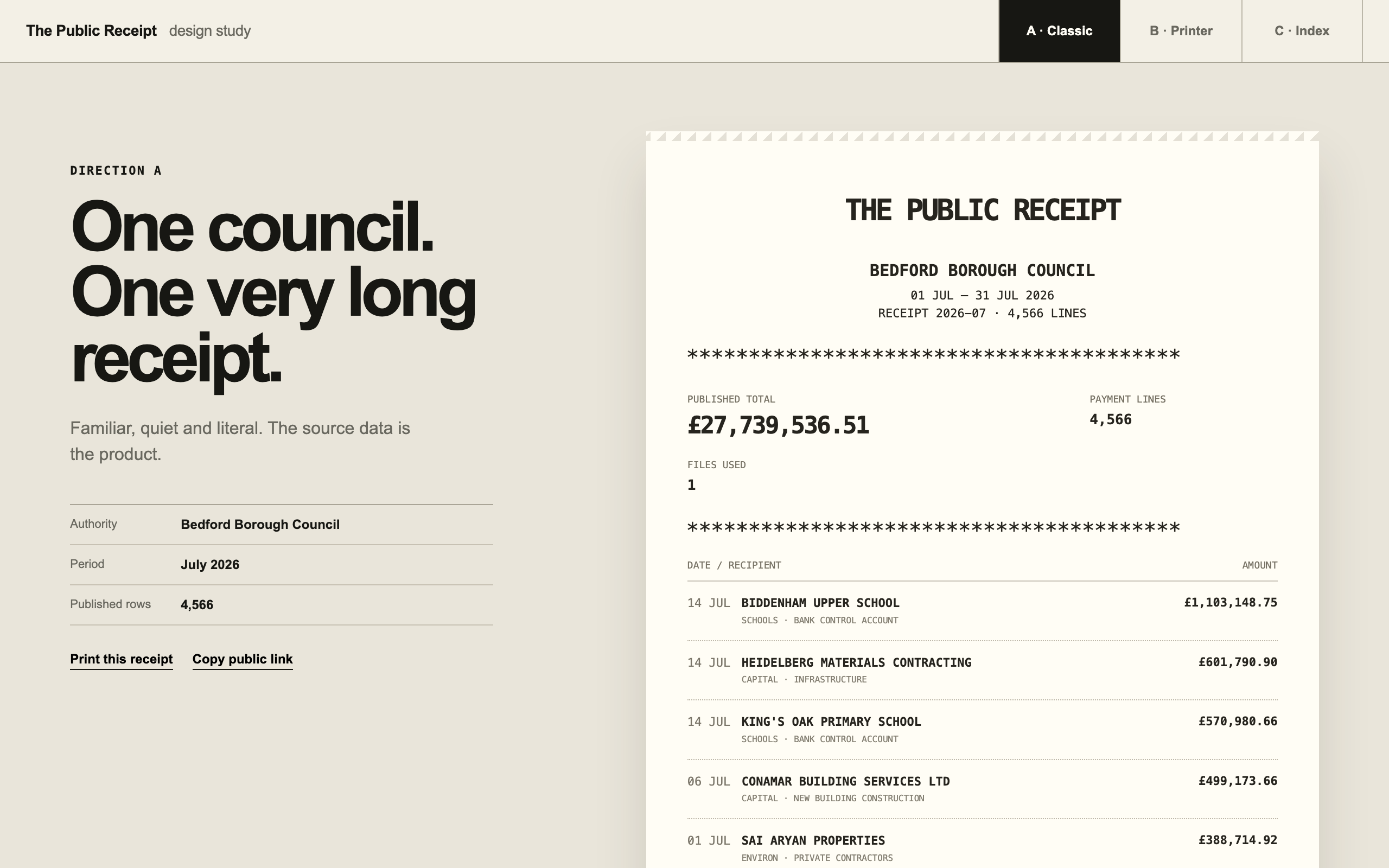
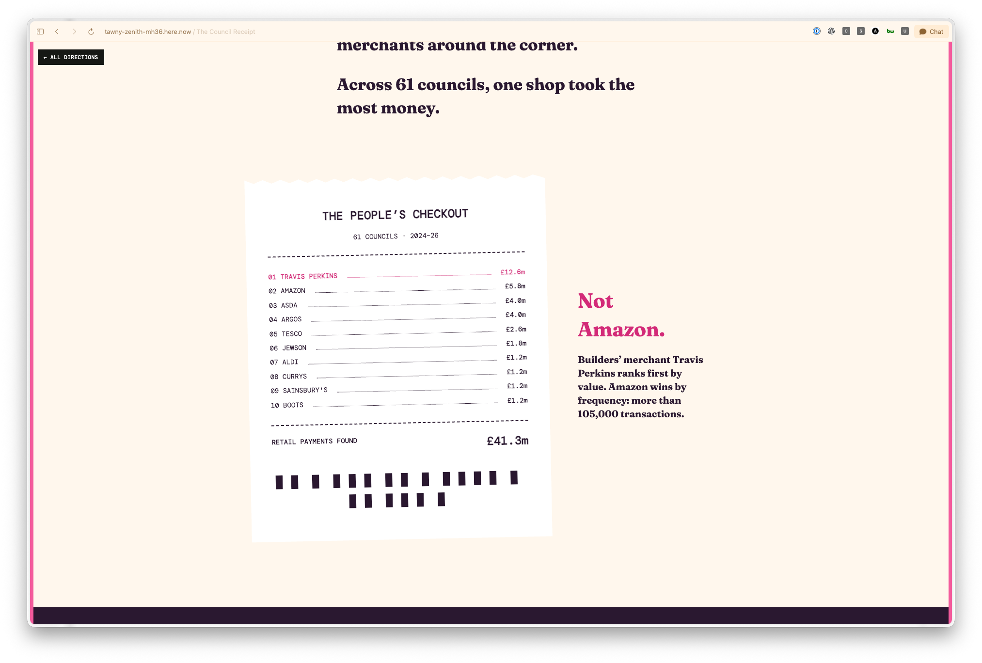
I initially set aside the design aspects to focus on data comprehensiveness. As my primary device is a MacBook Air, I avoided excess spreadsheet clutter, utilizing a Mac Mini for storage. I inquired, “What’s the best tool for managing extensive data?”—which led to Codex recommending Parquet and DuckDB—both quite new to me. Parquet organizes the data in columns, allowing specific queries to target the relevant segments, while DuckDB is a fast database operating within a single file.
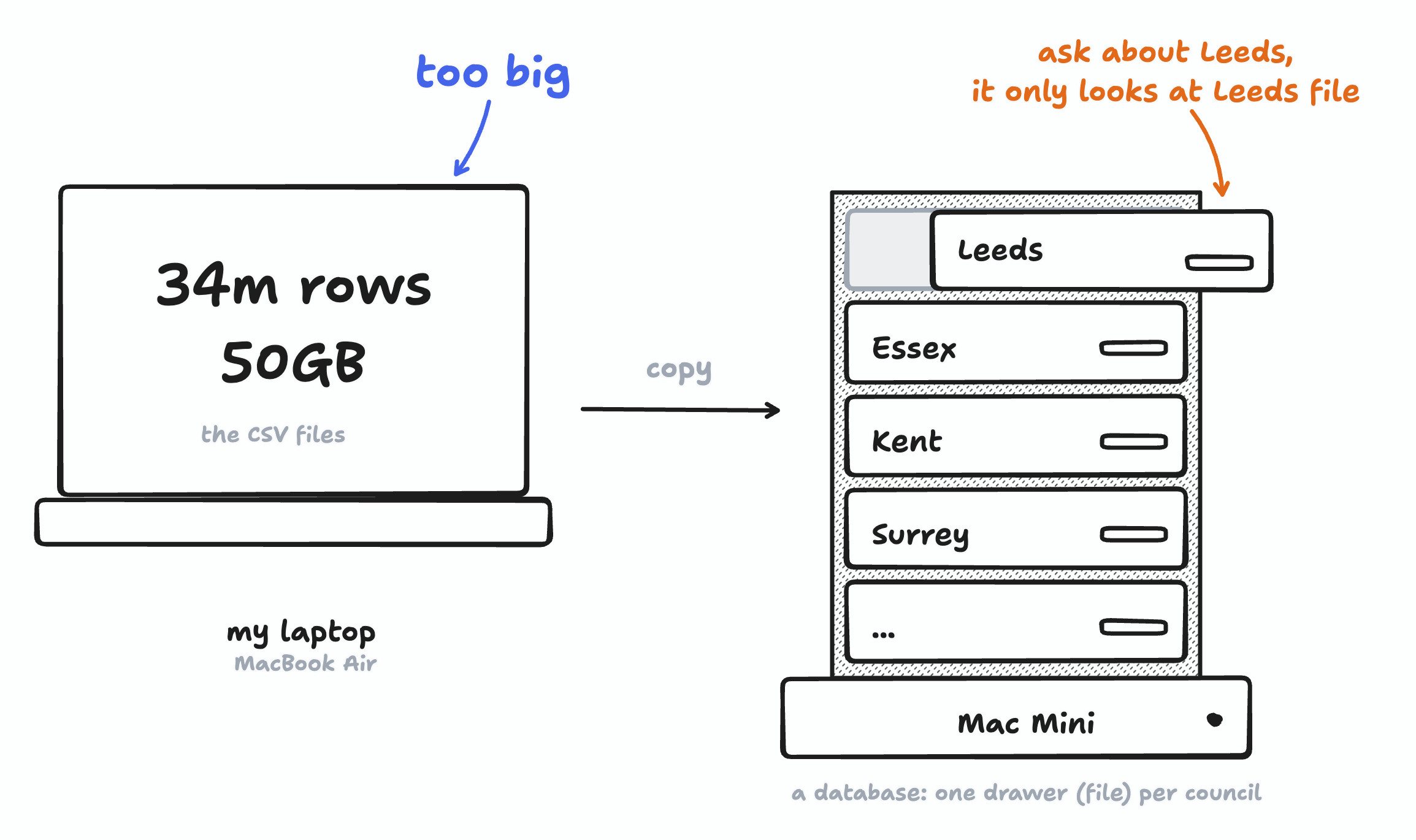
Codex configured the Mac Mini along with Parquet and DuckDB for testing. Next, we embarked on the comprehensive data collection: the UK has around 382 councils—our focus was on the 339 located in England and Wales. I initially gathered data from 78 councils, leading to a total of 34.35 million rows. However, certain councils, including large ones like Lancashire and Norfolk, were blocking our scrapers for the time being. I also discovered that Welsh councils do not have the same expenditure reporting requirements as those in England, prompting me to remove Welsh councils from the dataset.
With everything set up, I assigned Codex a single objective: to locate every council’s spending page in England, download accessible data, format it, have an auditor subagent validate the numbers, and load that data into DuckDB on the Mini.
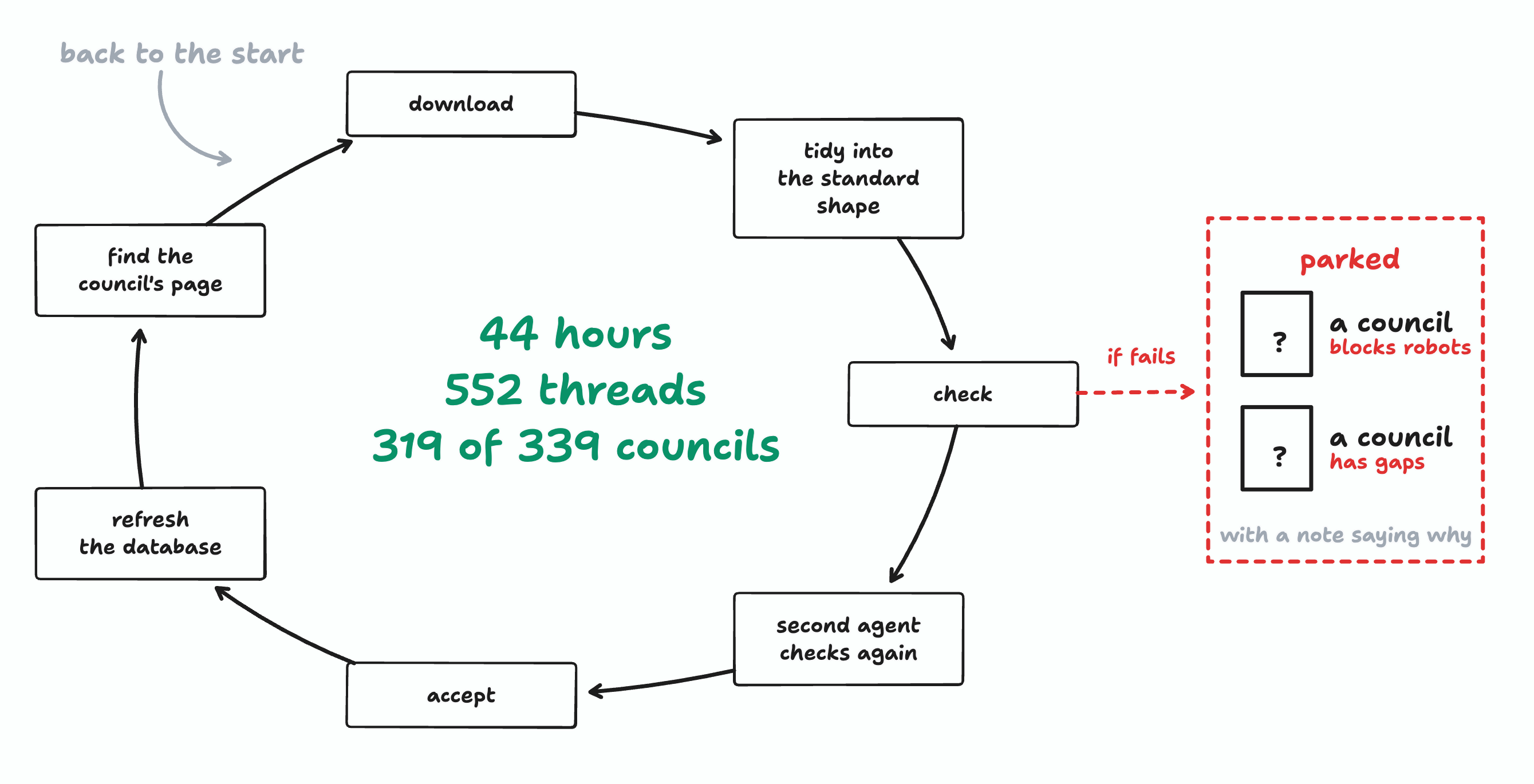
After around two days of continuous operation, the system was able to gather data from 319 out of 339 councils, despite encountering blockers from some councils. With the data collected, I commenced the prototyping phase, deploying four different tools simultaneously to create interactive comparison cards, a Council Ledger, charts, and maps. One of the features was the Money Map, providing an overview of the expenditure data, which proved effective for visualizing the information at once.
I curated various supplier logos for the map and experimented with the design to differentiate councils while ensuring the best aesthetic appeal.